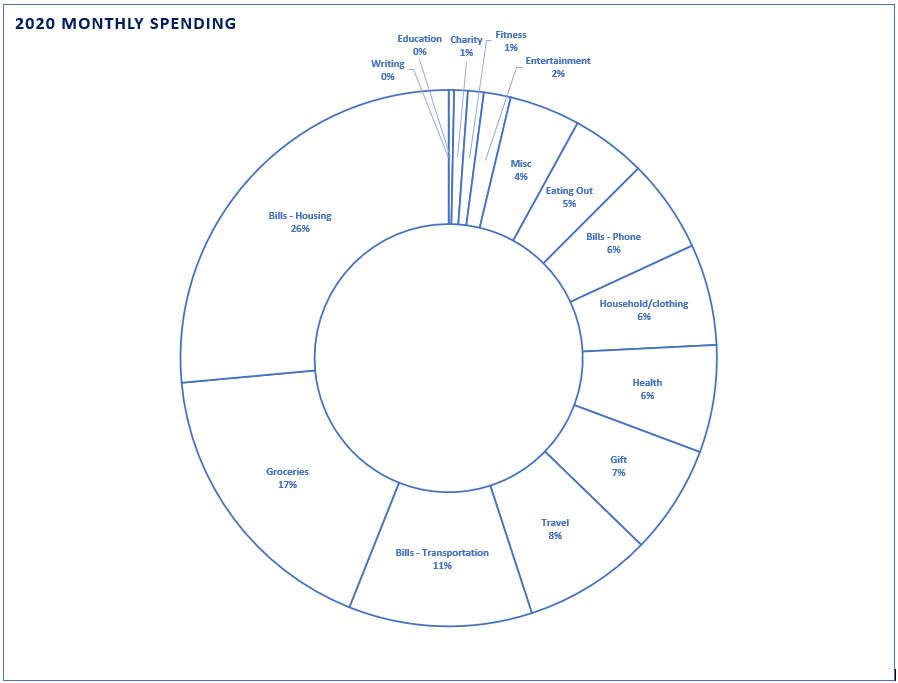
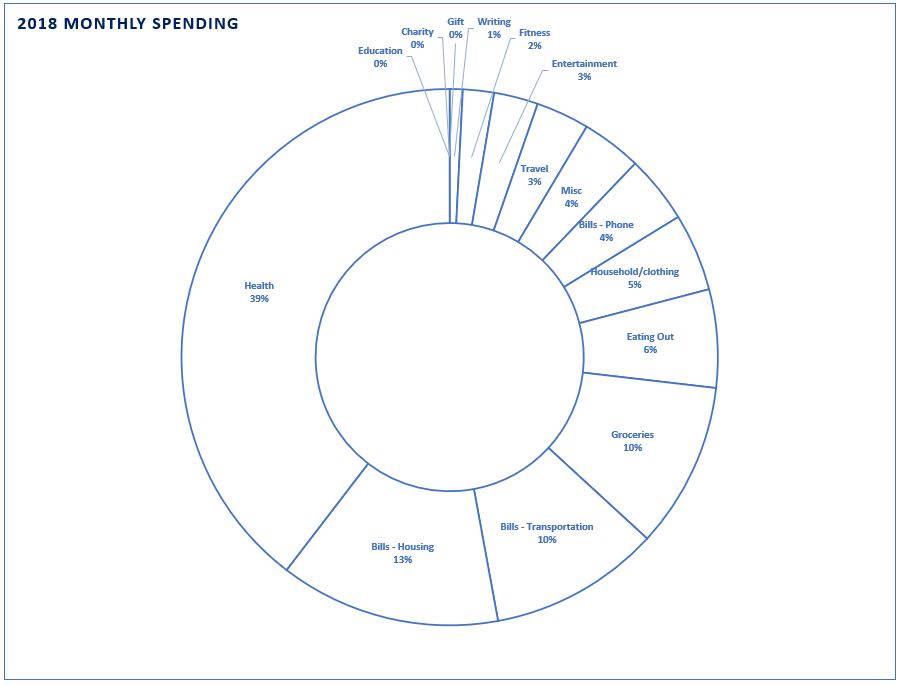
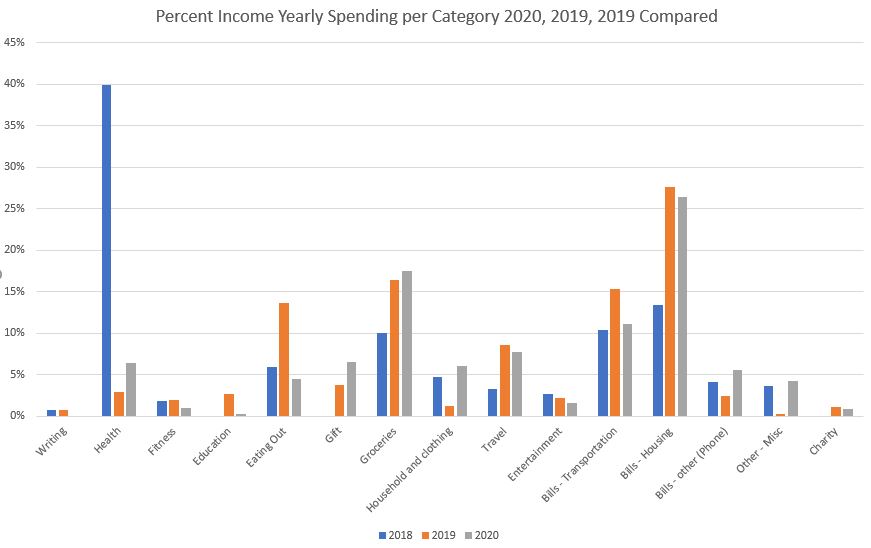
Here are some charts I made to compare my monthly spending over 2020, 2019, and 2018. I didn’t include taxes or my monthly HSA withholdings from my paycheck. But you can see where I spend the most of my money. This pie chart only accounts for 42% of my gross income. The rest of it goes towards taxes, HSA paycheck withholdings, investing, and savings. The purpose of these charts is to show changes in spending over time (across different categories).
Here are a few more fun numbers:
- I decreased my spending by 28% from 2018 to 2019 while increasing my income 16%
- I increased my spending 4% from 2019 to 2020 while increasing my income 3%
- I increased my total net worth by 73% from 2019 to 2020
- 40% of my spending was in “health” in 2018, 28% in “housing” in 2019, and 26% in “housing” in 2020 as my largest spend categories
- Eating comprises my highest spend category after housing in general. 22% in 2020, 30% in 2019, and 16% in 2018. As a non-fixed cost, this is quite high and if I were to cut back on spending this would be the ‘easiest’ category to cut back in. Even though I meal plan and have almost no food waste, I don’t budget this category and it’s my most indulgent spending throughout the year.
- My credit score took a dive in January of 2020 (I think because they changed how they calculate) by 7% and recovered 3% throughout the year.

Here is another way of looking at my spending categories over time. Note that I broke out my ‘writing’ category in 2020 and it’s now captured not as personal spending/income but in my business expenses so you don’t see it here in 2020.
The next two pie charts show my net worth split categories:


